How to Master the Lightning Landing Page Builder
- July 11, 2022
- Nebula Consulting, Pardot Landing Page Builder

The drag-and-drop Lightning Landing Page Builder, also known as the Enhanced Landing Page Experience, has been available since the Winter ’22 Release following high demand. The new editor brings a whole new user experience, and the transition from the classic editor can be tricky. Fear not! I’m here to help you master this great tool.
Before you dive into the specifics, take a look at our overview and make sure the feature is set up in your org. Are you all set? Then let’s look at my tips and recommendations:
Work on a large screen
There are so many great things in the Landing Page Builder that it simply can’t fit into a small window. Unfortunately, when you work in the editor, the different sections pile up and a scroll appears, making the editing process less than ideal.
Until that user experience is changed, I’d recommend opening the builder on a larger screen or zooming out in your browser.
Control your resized images
With the new builder, it is super easy to define how the images should resize on smaller screens. No need to code it in the HTML section, but you should be aware of what the different options mean exactly:
- F
 ill: This is the default. The image is resized to fill the given dimension. If necessary, the image will be stretched or squashed to fit the space.
 - Contain: The image will keep its aspect ratio, but is resized to fit within the given dimension.
- Cover: The image will its aspect ratio and fills the given dimension. The image will be clipped to fit.
- None: The image is not resized.
- Scale Down: The image is scaled down to the smallest version of none or contain.
(Source: w3schools.com)
The next time you work in the builder, have a play with this section to see a live example and select the option that suits the purpose of the image.
Divide your columns and they will conquer
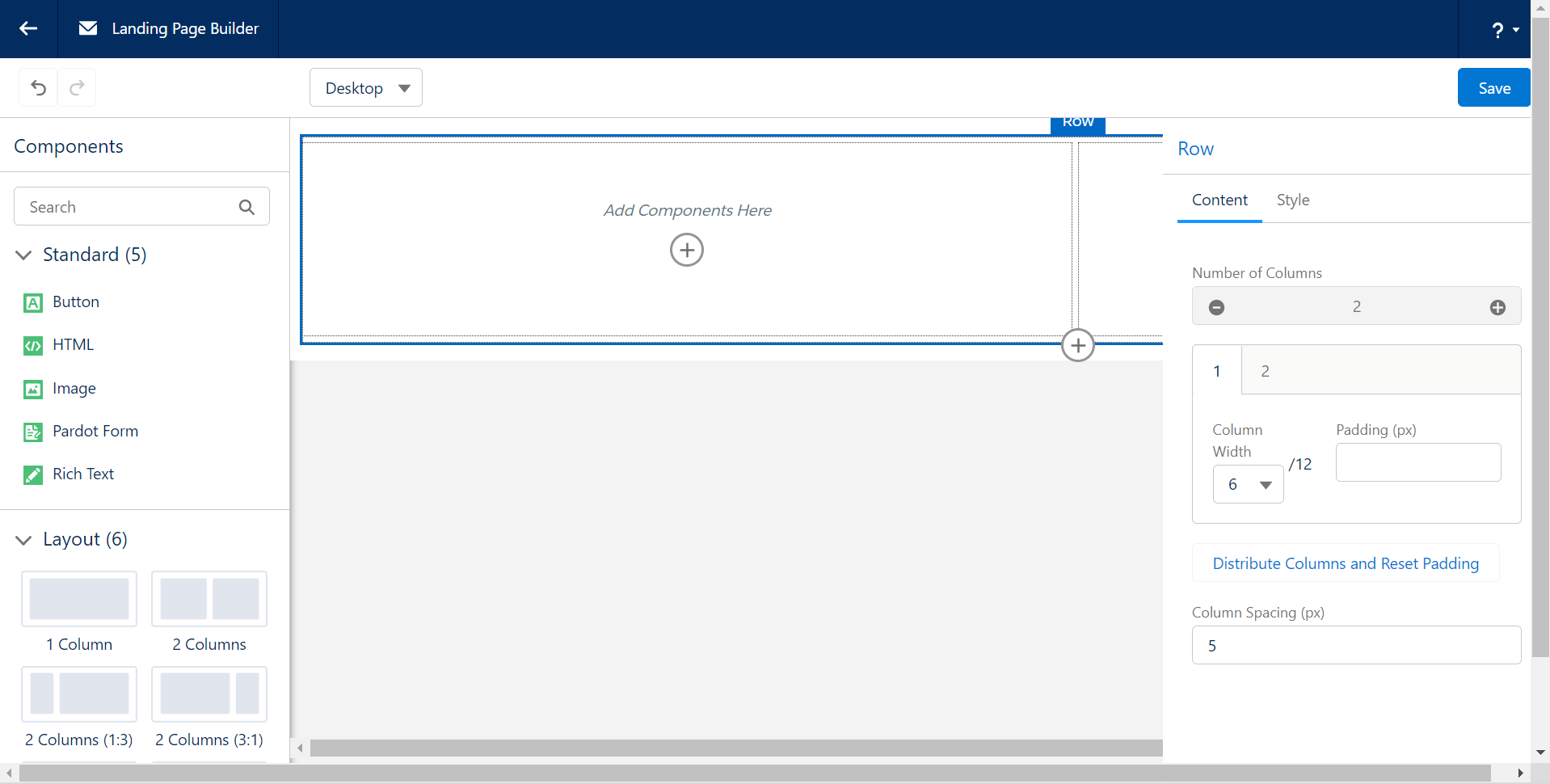
 The layout components are using a maximum of 12 column system (influenced by Bootstrap) which counts as the 100% width of that section. Use that as a scale to set the width of the different columns.
You can easily create a layout component with up to 6 columns by clicking on the + icon on the right-hand side. Then you can set the width of each column one by one, or click on the ‘Distribute Column and Reset Padding’ link to have a consistent layout.
Style your form with a stylesheet
Although you have a Style section on the Pardot form component, for consistency and better user experience I recommend an alternative. Instead, ask your design team – or our brilliant consultants – to create a stylesheet document that you can depend on.
Once the file is created and uploaded to Pardot, you can reference it in two places:
- In the Builder, in an HTML component.
- In the Landing Page component’s Settings view, under the Header section.
That will control all your form styling attributes in one central place, which will make maintenance much easier.
Tell me more…
Well, we have plenty more insights about the Lightning Landing Page Builder that we share with our community. If you are keen to learn more, get in touch with our team – we’d love to hear from you.
This Pardot article written by:
Nebula Consulting
Get the most out of marketing automation with Pardot. Attract and nurture leads with personalized, targeted journeys and adapt quickly with intelligent campaign performance insights. Start with the right building blocks to ensure you get the most out of your marketing automation strategy.
Original Pardot Article: https://nebulaconsulting.co.uk/insights/how-to-master-the-lightning-landing-page-builder/
Find more great Pardot articles at https://nebulaconsulting.co.uk/insights/
Pardot Experts Blog
We have categorized all the different Pardot articles by topics.
Pardot Topic Categories
- Account Based Marketing (ABM) (7)
- Business Units (14)
- ChatGPT / AI (3)
- Completion Actions (5)
- Connectors (10)
- Custom Redirects (4)
- Data Cloud (3)
- Demand Generation (8)
- Dynamic Content (7)
- Einstein Features (11)
- Email Delivery (17)
- Email Open Rates (3)
- Pardot A/B Testing (2)
- Email Mailability (16)
- Do Not Email (1)
- Double Opt-in (2)
- Opt Out / Unsubscribe (14)
- Email Preferences Page (6)
- Engagement Studio (16)
- Industries (1)
- Non Profit (1)
- Landing Pages (9)
- Lead Generation (1)
- Lead Management (13)
- Lead Routing (3)
- Lead Scoring (16)
- Leads (3)
- Marketing Analytics – B2BMA (9)
- Marketing Automation (1)
- Marketing Cloud (3)
- Marketing Cloud Account Engagement (4)
- Marketing Cloud Growth (2)
- New Pardot Features (6)
- Opportunities (2)
- Optimization (2)
- Pardot Admin (65)
- Duplicates (1)
- Marketing Ops (1)
- Pardot Alerts (1)
- Pardot API (2)
- Pardot Automations (3)
- Pardot Careers (12)
- Pardot Certifications (4)
- Pardot Consulting (1)
- Pardot Cookies (4)
- Pardot Custom Objects (3)
- Pardot Email Builder (8)
- Pardot Email Templates (10)
- HML (6)
- Pardot Events (17)
- Pardot External Actions (1)
- Pardot External Activities (4)
- Pardot Forms (29)
- Form Handlers (8)
- Pardot Integrations (21)
- Data Cloud (2)
- Slack (1)
- Pardot Lead Grading (5)
- Pardot Lead Source (2)
- Pardot Lightning (1)
- Pardot Migration (1)
- Pardot Nurture / Drip Campaigns (2)
- Pardot Personalization (3)
- Pardot Profiles (1)
- Pardot Releases (18)
- Pardot Sandboxes (2)
- Pardot Segmentation (5)
- Pardot Strategy (7)
- Pardot Sync (2)
- Pardot Sync Errors (1)
- Pardot Tracker Domains (5)
- Pardot Training (3)
- Pardot Vs Other MAPs (4)
- Pardot Website Tracking (2)
- Reporting (22)
- Salesforce and Pardot (31)
- Marketing Data Sharing (2)
- Pardot Users (3)
- Salesforce Automation (5)
- Salesforce Flows (2)
- Salesforce Campaigns (22)
- Salesforce CRM (3)
- Record Types (1)
- Salesforce Engage (3)
- Salesforce Queues (2)
- Security and Privacy (1)
- Tags (3)
- The Authors (540)
- Cheshire Impact (9)
- Greenkey Digital (55)
- Invado Solutions (37)
- Jenna Molby (9)
- Marcloud Consulting (6)
- Nebula Consulting (67)
- Pardot Geeks (44)
- Salesforce Ben | The Drip (242)
- SalesLabX (16)
- Slalom (4)
- Unfettered Marketing (51)
- Uncategorized (1)
- Website Tracking (2)
- Website Search (1)
More Pardot Articles
See all posts
This Pardot article written by:
Nebula Consulting
Get the most out of marketing automation with Pardot. Attract and nurture leads with personalized, targeted journeys and adapt quickly with intelligent campaign performance insights. Start with the right building blocks to ensure you get the most out of your marketing automation strategy.
Original Pardot Article: https://nebulaconsulting.co.uk/insights/how-to-master-the-lightning-landing-page-builder/
Find more great Pardot articles at https://nebulaconsulting.co.uk/insights/

 ill: This is the default. The image is resized to fill the given dimension. If necessary, the image will be stretched or squashed to fit the space.


